
The Describe Image task is a PTE Core Speaking question type that tests your ability to look at an image, understand the main information, and describe it clearly in spoken English.
You may see different types of images, such as a picture, line graph, bar chart, pie chart, table, map, diagram, or flowchart. Your answer should be organized, fluent, and easy to follow.
Describe Image Scoring
| Criteria | What It Measures | Scoring Range |
|---|---|---|
| Content | How well you describe the main information in the image | 0 to 5 |
| Oral Fluency | How smoothly and naturally you speak | 0 to 5 |
| Pronunciation | How clearly and understandably you pronounce your words | 0 to 5 |
Task Format
During the preparation time, quickly identify the type of image, find the most important information, and decide how to organize your answer. When the microphone opens, describe the image clearly and confidently.
| Part | Time |
|---|---|
| Preparation time | 25 seconds |
| Speaking time | 40 seconds |
A Simple Structure to Use
You do not need to describe every detail. A strong response usually follows this structure:
- Introduction: Say what the image shows.
- Key details: Describe at least 3 important features, trends, numbers, or actions.
- Conclusion: Give a short overall summary.
To aim for a high score, especially 80+, try to speak for most or all of the available 40 seconds while staying clear, fluent, and organized.
You can use this simple template:
[The image shows...].
[Key detail 1].
[Add one short extra detail].[Key detail 2].
[Add one short extra detail].[Key detail 3].
[Add one short extra detail].[Overall, the image suggests/shows that…].
Example 1: Describing a Picture
Let's first look at a picture-based Describe Image task.
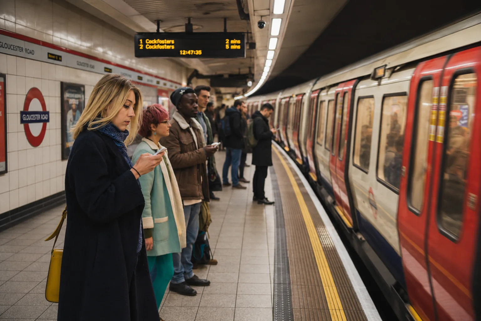
The image shows people waiting on a subway platform while a train is stopped beside them. Several passengers are standing near the edge of the platform, and some of them are looking at their phones. The setting appears to be a busy underground station.
Step 1: Identify the Type of Image
This is a picture, not a graph or chart. For a picture, focus on:
- the main setting
- the people or objects
- the actions
- the overall atmosphere
In this example, the setting is a subway station, the main objects are the train and the passengers, and the main action is people waiting or using their phones.
Step 2: Scan for Key Details
For this image, you can notice these important details:
- There is a train on the right side of the image.
- Several people are waiting on the platform.
- Some passengers are looking at their phones.
- The station sign says Gloucester Road.
- The scene looks like a normal public transportation setting.
Do not spend time describing every person, every color, or every sign. Choose the details that help the listener understand the image clearly.
Step 3: Organize Your Response
For a picture, you can organize your response like this:
The image shows people waiting at a subway station.
A train is stopped beside the platform on the right side of the image.
Its red doors and windows are clearly visible.Several passengers are waiting on the platform.
Some passengers are standing close to the edge while looking at their phones.The station appears to be busy underground.
There are signs and advertisements visible along the platform.Overall, the image shows a typical public transportation setting.
Example 2: Describing a Line Graph
Now let's look at a graph-based Describe Image task.
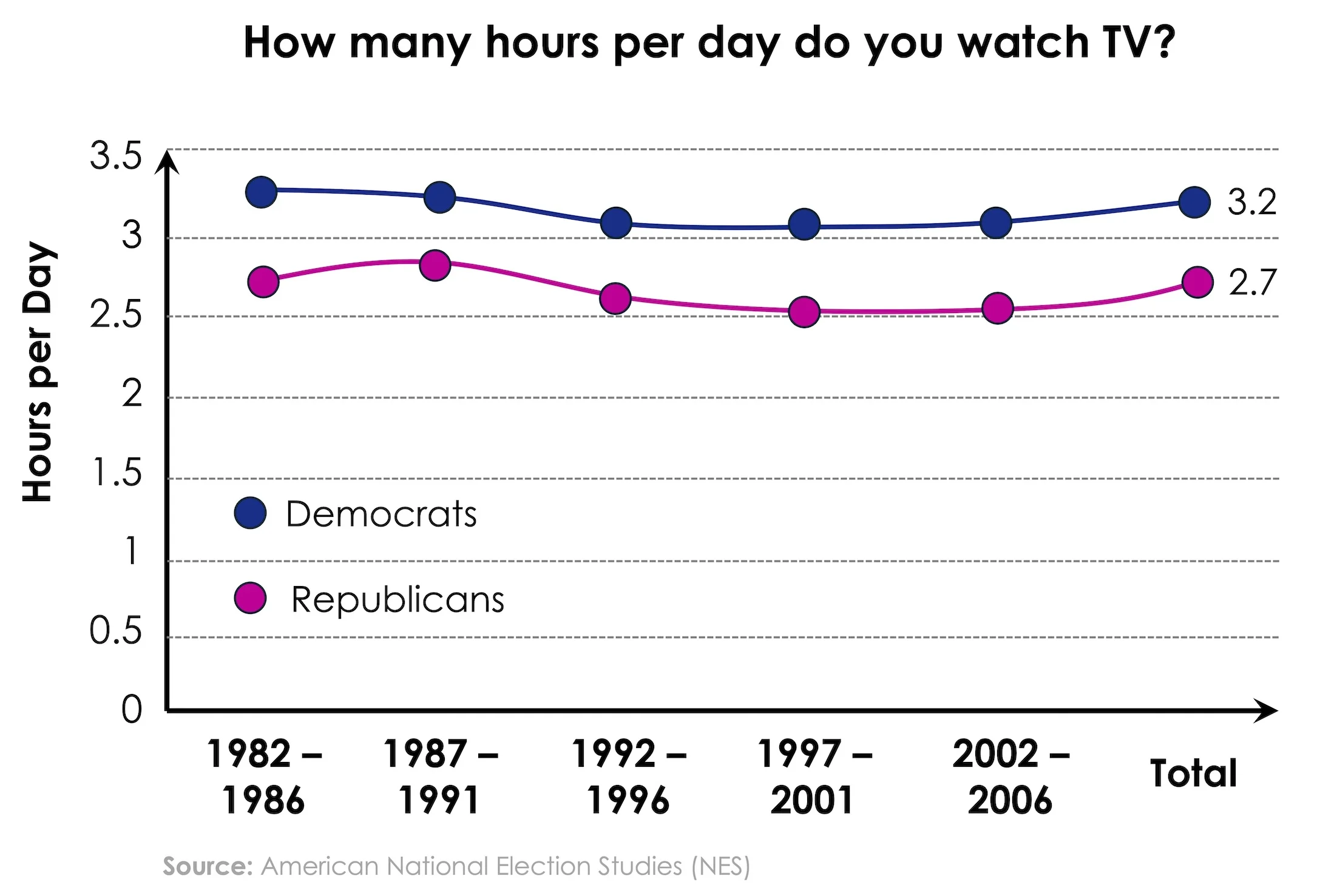
The image is a line graph titled "How many hours per day do you watch TV?" It compares the average number of hours per day spent watching TV by Democrats and Republicans across several time periods.
Step 1: Identify the Type of Image
This is a line graph. For a line graph, focus on:
- the title
- the groups being compared
- the units
- the main trend
- the highest or lowest points
- the final or total values
In this example, the graph compares Democrats and Republicans, and the unit is hours per day.
Step 2: Scan for Key Information
Back to the same graph, the most important details are:
- Democrats watched more TV than Republicans across all periods.
- The Democratic line stays around 3 to 3.3 hours per day.
- The Republican line stays around 2.5 to 2.8 hours per day.
- The total values are about 3.2 hours for Democrats and 2.7 hours for Republicans.
- Both lines show only small changes over time.
You do not need to mention every year or every data point. Focus on the overall comparison and the main trend.
Step 3: Organize Your Response
For a graph, you can organize your response like this:
The image shows a line graph about how many hours per day Democrats and Republicans watch TV across different time periods.
The x-axis shows the years from 1982–1986 to 2002–2006.
The y-axis shows the number of hours watched per day.Democrats watched more TV than Republicans across all the time periods.
Their figures stayed slightly above 3 hours per day.Democrats had a total average of about 3.2 hours.
Republicans had a total average of about 2.7 hours.Overall, the graph shows that Democrats consistently watched slightly more TV per day than Republicans.
Common Mistakes to Avoid
-
Describing too many small details
Trying to mention every number, object, or label can make your answer unfocused.
Choose the most important features and organize them clearly. -
Ignoring the title or main topic
If you do not mention what the image is about, your response may sound incomplete.
Start with the title or the main subject of the image. -
Listing details without structure
Randomly describing parts of the image can make your answer hard to follow.
Use a simple structure: introduction, key details, and conclusion. -
Speaking too slowly
Slow speech and long pauses can reduce fluency and make you run out of time.
Speak at a natural pace and keep your response moving. -
Overloading the response with numbers
Giving too many exact numbers can make your answer sound mechanical.
Focus on the main trends, comparisons, or highest and lowest points. -
Inventing information
Adding details that are not visible in the image can hurt your content score.
Describe only what you can clearly see in the image. -
Ending without a conclusion
Stopping suddenly can make your response feel incomplete.
Finish with a short overall sentence that summarizes the image.
Practice more Describe Image questions to build a clear structure, stronger fluency, and more confidence describing different image types under test conditions.